Blog Post Title One
The Flower Pot
The Trinity Bellwoods Cannabis Supplier
The Interior Design Process from Concept to Finished Product
The Beginning, The Existing Space
When marijuana became legal, a builder I’d worked with in the past asked me if I wanted to work on the design of a cannabis shop. I was delighted! I’d only just started my business earlier that year and wanted expand my operations into the commercial and restaurant interior design, which is what I’d primarily been focusing on in my previous jobs.
The duo that was opening up the shop had rented a retail space a year prior, based on early promises of legalization. As the government dragged their feet, they utilized the space as a coffee shop until they were able to convert operations. Situated just on the north side of Trinity Bellwoods park, right on Dundas St. W, the location was excellent. Because they were in a state of limbo, they hadn’t put a ton of focus on the interior design of the space, but had equipped it with just enough for a coffee shop to operate - an espresso machine, a baked goods display case, a sink, a mini fridge and some local artwork! Below you’ll find some pictures of the ‘before’.


Concept
General Feel
The lay person might not be able to look at this space and see an amazing opportunity, but the skill of an interior designer is the ability to see a totally blank canvas amidst chaos and clutter. The first thing the clients and I discussed was the concept. How did they want the space to feel? Modern? Traditional? Hipster? Because the client wanted to preserve much of the existing brick, we proposed the idea of re-creating an apothecary shop feel. They were selling herbs, after all. Medicinal ones at that. The images below are the ones we agreed to move forward with as general the basis for our concept.


Concept
Cultural Integrations
There were a few extra requests in the name of concept. The client had grown up in Amsterdam, and wanted to incorpoerate her Deutch background into the interior design. The two primary things were Delft tile (blue painted patterns on a white background), and a worn-looking painted wood floor. The existing floor was a stained wood, so painting it was not a problem, but what level of wear? See below for the images we used as reference for the Deutch inspirations.


Concept
Logo
Lastly, the logo. The client had one created and wanted it incorporated into the interior design, as well as with a neon sign in the window. See below for their logo and concept for neon sign (generated by the neon company).


Measuring, Documenting, Modelling
Before doing anything in a renovation, you have to measure the whole space and recreate it digitally. In my case I do it in 3D. This kind of recreation also helps you mentally clear all of the clutter that exists in the existing space, and re-image it as a clean slate. Below are some pictures of the blank site model before I got started making magic.


A view slicing through the top of the walls and looking down.

An upside down view, showing the ceiling.
Design Time
The Model
I had recently made the switch from AutoCad to SketchUp and LayOut, and though I was still learning, I was really excited to be bringing the space to life 3D. With the client, we discusses the layout of the space, where customers would enter, where the visual barrier would be (customers were not supposed to be able to see the cannabis products), how products would be displayed, and where they would check-out. With this, I began to play. The cabinetry was designed in the style of the apothecary shops, the back wall of the checkout area covered in the Deutsch tile, the white painted floors, the neon sign in the window and visual barrier/entry for customers beyond the main entrance. Here are some screenshots of the model. Below you’ll see the images from my SketchUp Model that I used to walk the client through. During the design meeting, I used the renderings for presentation, and the model for doing 3D walk-throughs so they could understand it from every angle.

The client had imagined that the counter and check-out area would remain in the same location as before, but to me, that location had a narrowing effect right in the most important part of the space - the middle. Secondly, the property had a small wing attached to it, which I felt was excessive. The main space itself was more than big enough to display all of their product and more. I also wanted to celebrate the beautiful brick archway, so this gateway became both closed off from the wing space (which they now rent out for supplemental income) as well as a prominent design feature. The cabinetry and paneling wrapped around the brick and emphasized it’s shape.

Because width was regained from the space by moving the checkout counter to the rear, there was room for a display table, which emulated the apothecary style with it’s wooden frames and spun legs. The Back wall because am important feature because of the custom tile, but more on that later.

One of my primary goals for this space was to make sure that the foreboding feeling of most cannabis shops did not exist here. The easiest way to not have your product visible is to block the windows, but that obliterates any hope of the space feeling welcoming. Instead, I created a sitting area in the front of the space, and a partial height panels (with the middle one that is a swinging door). This way, not only could the public look into the space, but they could also see about two thirds of the space beyond, with only the middle portion obstructed. More on the panels themselves further down.

To continue the charming and old world feel on the exterior, I created some traditional details including lower paneling, arched window frames and flanking pilasters. It did not get built exactly as show, but rather a paired down version.

Because this piece of property is long, as most Toronto retail spaces are, I segmented it by introducing archways to create more comfortably proportioned spaces, as well as blocking off a sizeable chunk of the rear in order for them to store the product. They also have access to the basement, but product is much easier to access if a flight of stairs is not in the way. Truncating the space this way worked functionally, as well as aesthetically.

The sides of the shop being flanked with full height display and storage meant that the client would have no issue with display and
Presentation
Vray Renderings
I was still new to Vray, but though I did a pretty good job with these renderings! They helped the client really get a sense of what the finished product would look like in terms of the materials, finishes, how the light would come in, etc.


Notable Features
Custom Logo Tiles
Two of the extra ‘asks’ that the client had were to do with traditional Dutch blue tiles, as well as a blue logo. I began to wonder if I could use the blue logo to create a pattern that, from a distance, emulated the tile look. I played around with the logo, came up with a few terrible patterns, a few okay ones, and then eventually got it right and landed on something that worked beautifully. I then had a company who prints custom patterns on tiles create a batch for tiling the back counter wall.

The single tile pattern that I had sent for printing.

A single finished tile.

The pattern with each tile rotated so that the solid corners met.

Altogether.
Notable Features
Custom Textured Glass Panels and Door
In an effort to make the Flower Pot feel more welcoming, the design was to create partial panels in a style that looked as though it was crafted in the previous century. I designed them with the intention of having them made by a company who I’ve used in the past for skylight lenses, and stained glass features. After receiving the quote ($13,000), there was a realization that either I had to craft these myself, or come up with another solution. Luckily, I’m incredibly handy and artistic. I’d had trepidations about the glass, as it would heavy and fragile, and exposed to a lot of traffic. There was a strong risk that it might be damaged or broken, so it actually made more sense to make it out of flexi glass and a faux stained glass effect.

Me, creating the stained glass texture on the plexiglass panel that already has the faux lead pattern of the logo applied.
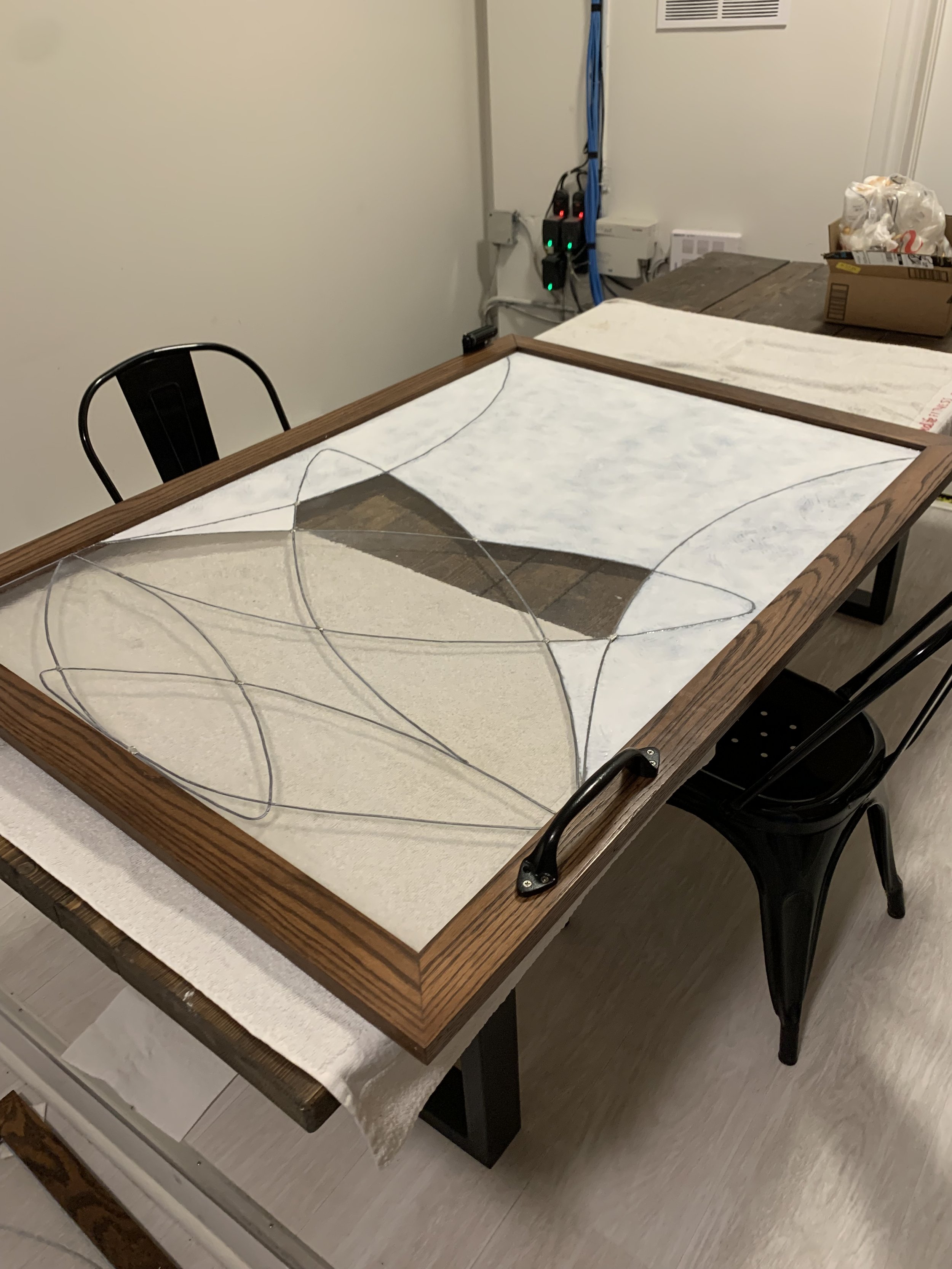
Continue glass production with the wood frames in place.

Close-up of the textured ‘glass’.
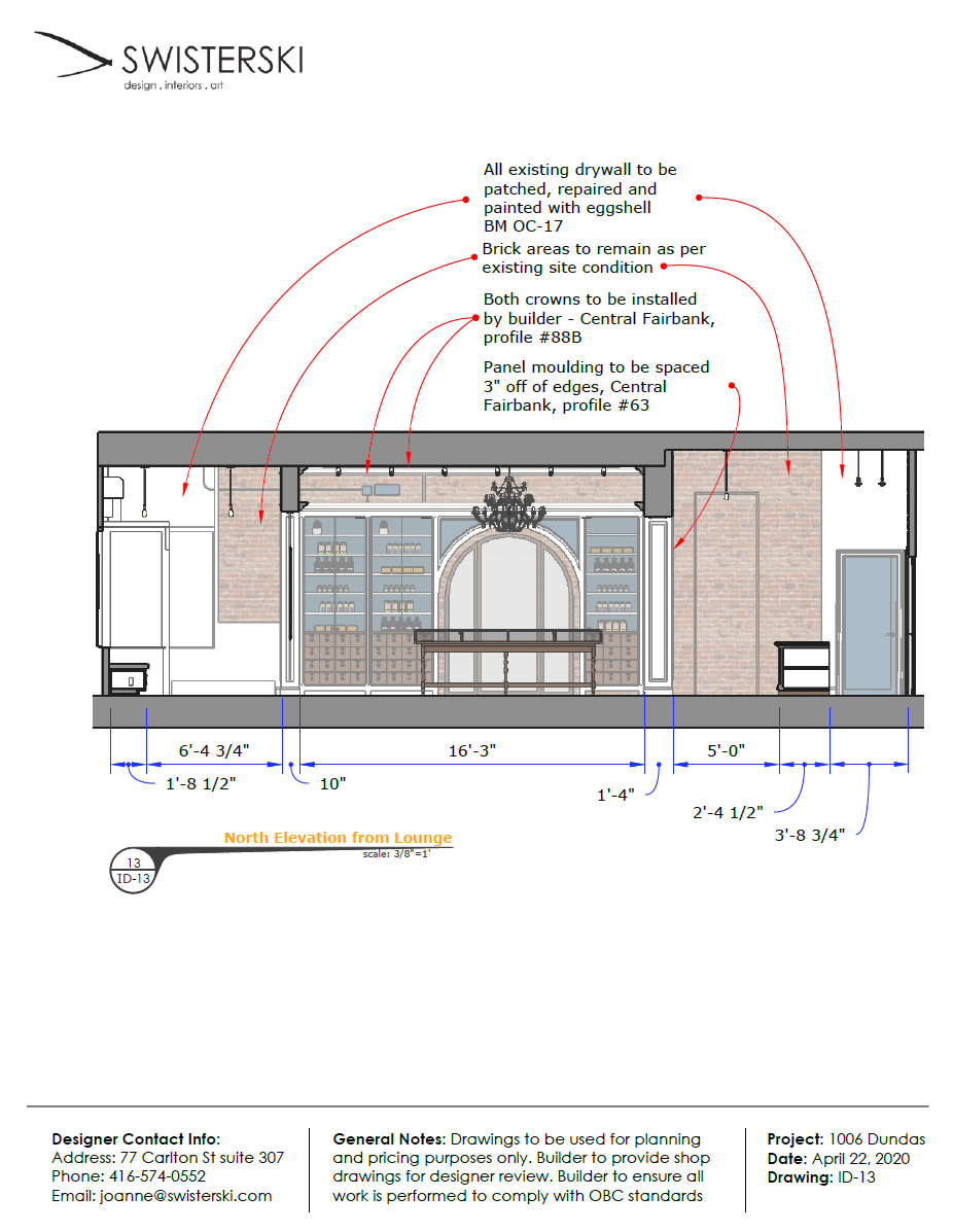
Construction
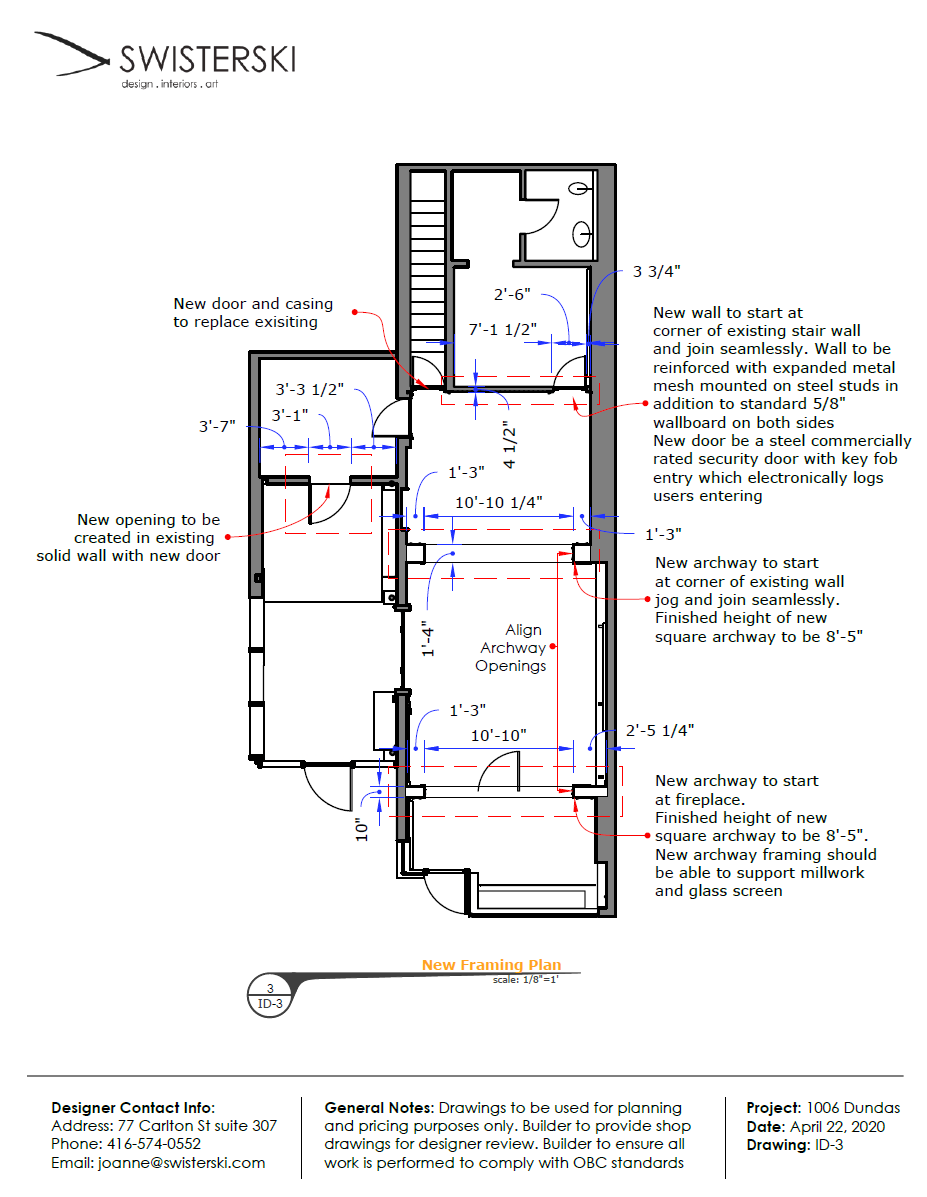
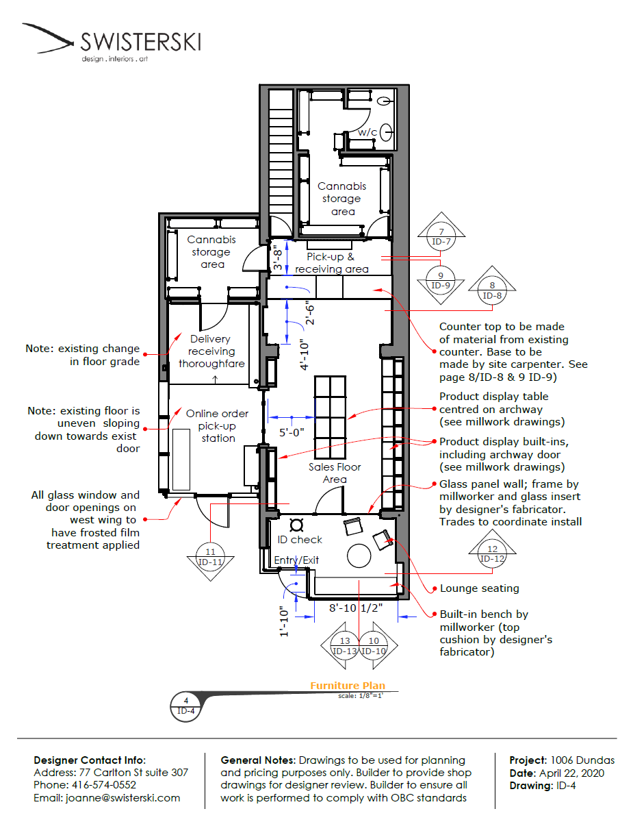
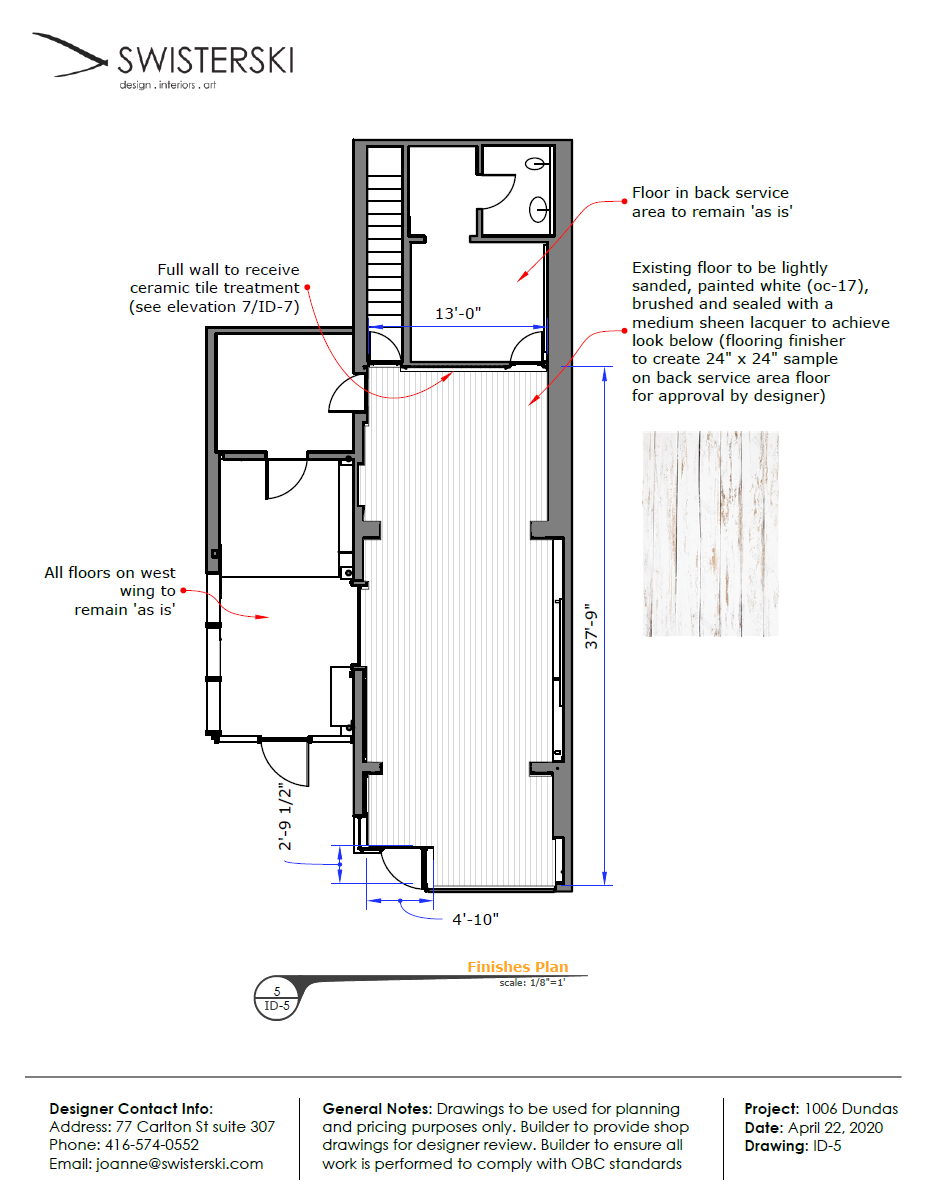
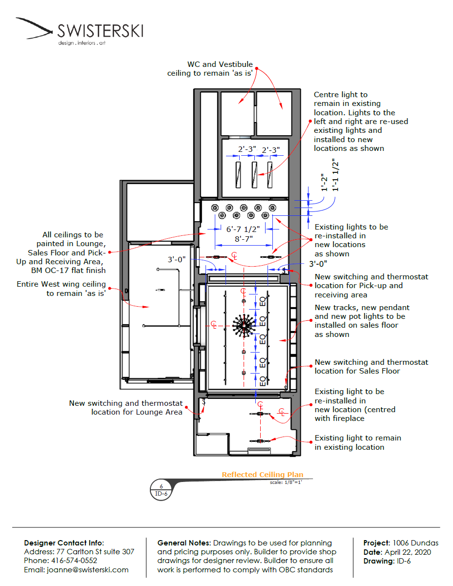
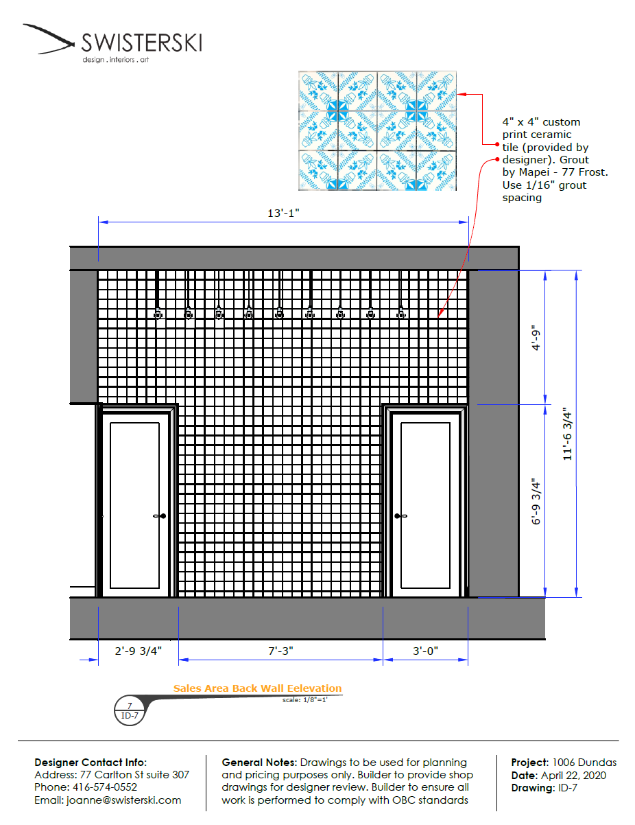
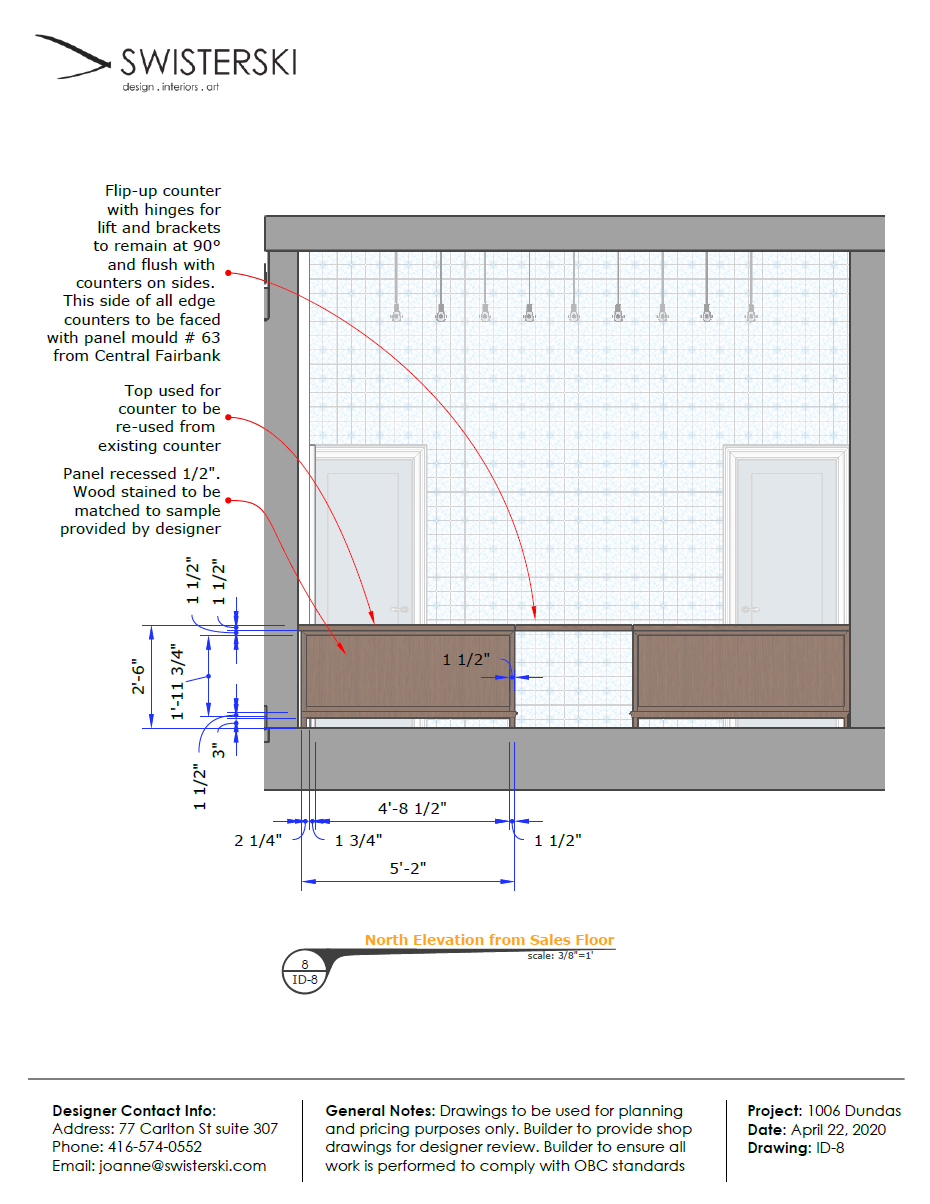
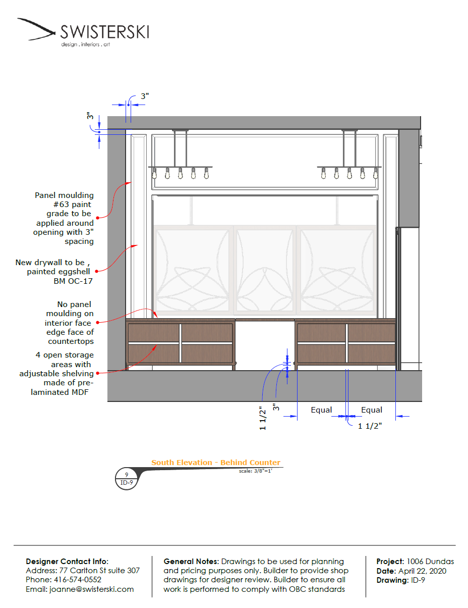
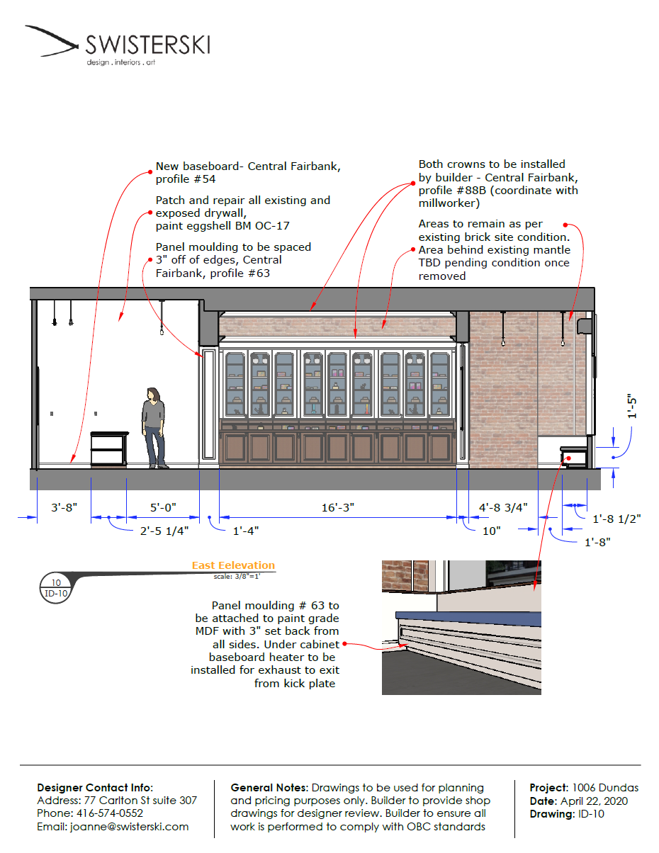
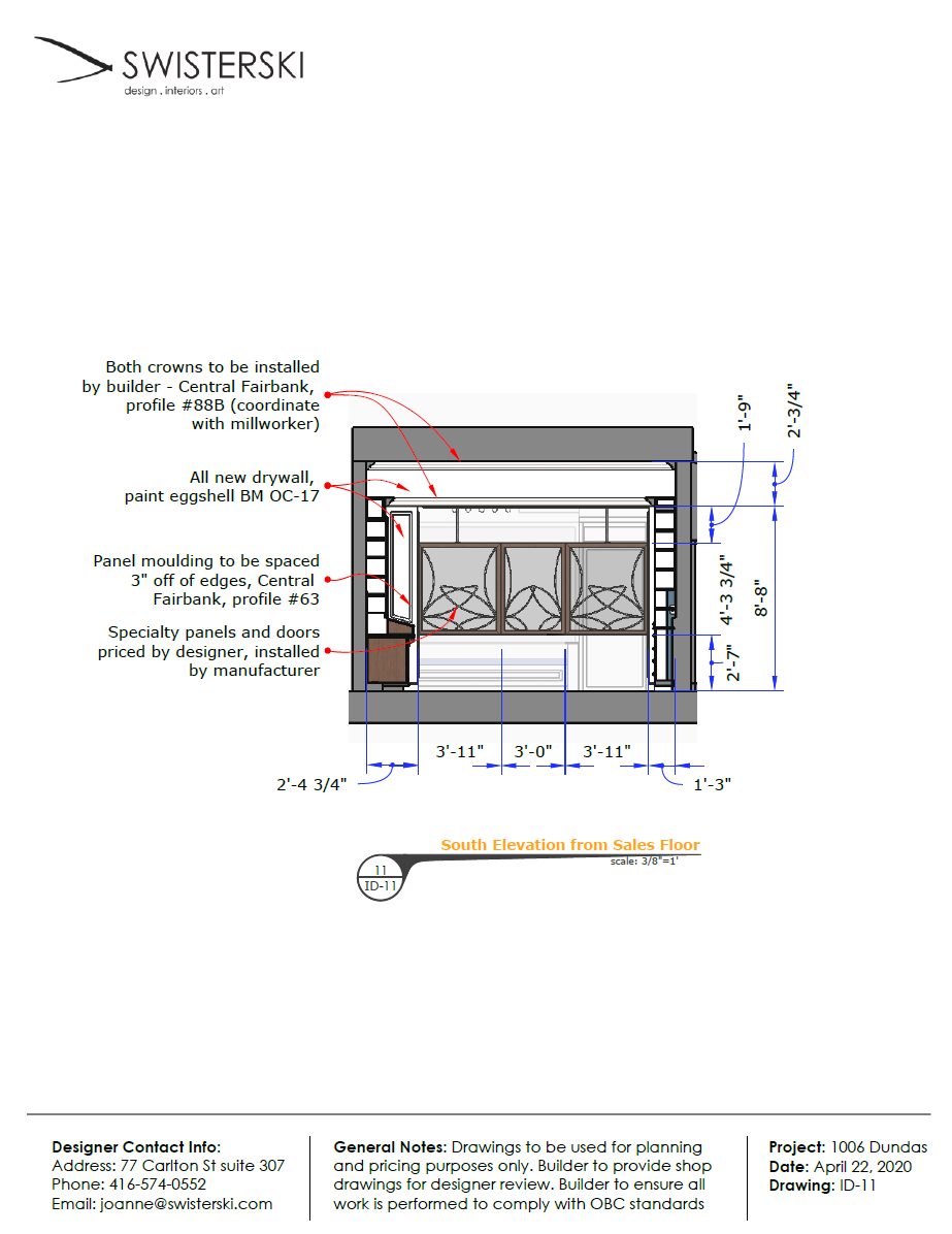
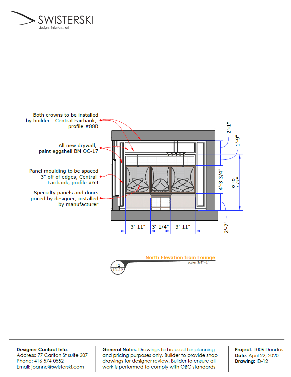
Drawing Sets
Again, I was new to SketchUp LayOut, but I created these sets using that. I’m still not sure about how I feel with colour in construction drawings, but at the time I didn’t know how to work around it. In any case, it seemed to help the contractor to have everything colour-coded according to their respective materials.
Construction
Process Photos
It’s always exciting seeing a space transformed. With renovations, you discover all manner of surprises, and you need to be constantly problem solving. Being amenable to changes and remaining adaptable is key. See below for photos of he construction process.
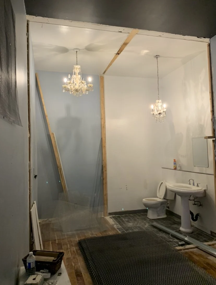
The old bathroom becoming exposed and eventually removed.

Behind the old bar lay a surprised recess in the brickwork. We ended up turning it into a shelving display.

One of the archways taking shape. You can see the how straight the ceilings are in these old building :P
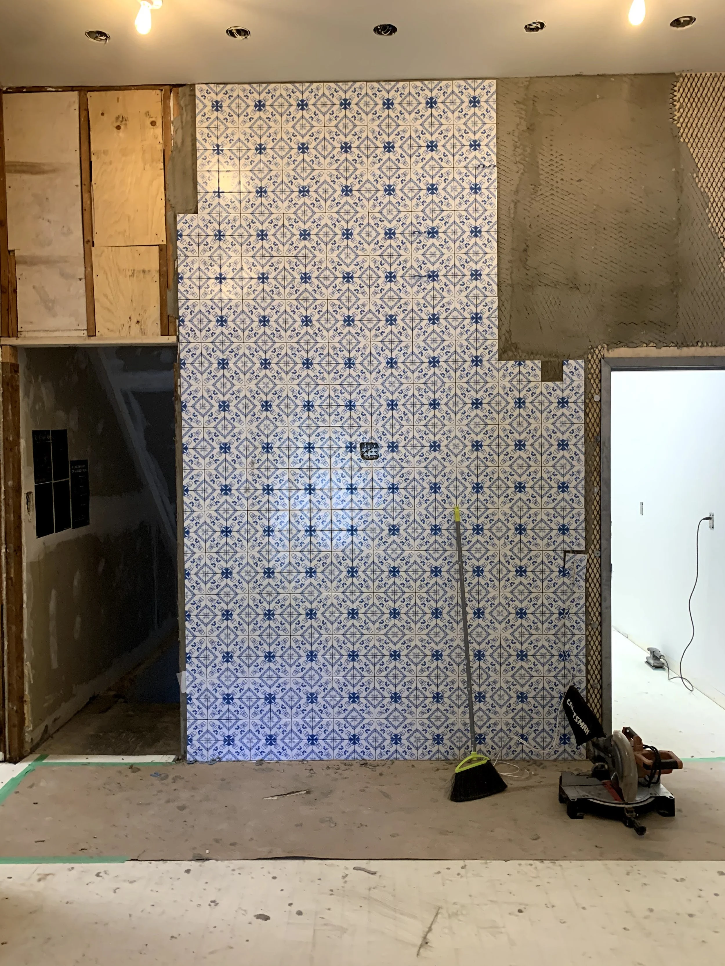
A partially tiled back counter wall.

Tacoma Woodworks (the millworker) putting up a railing to secure the cabinetry to.

Lastly, at the end of the project, the budget was down to the wire, so instead of buying new furniture, I sourced some vintage and antique pieces to fill the space instead. These unique pieces proved to be eye catching for passer byers looking in.
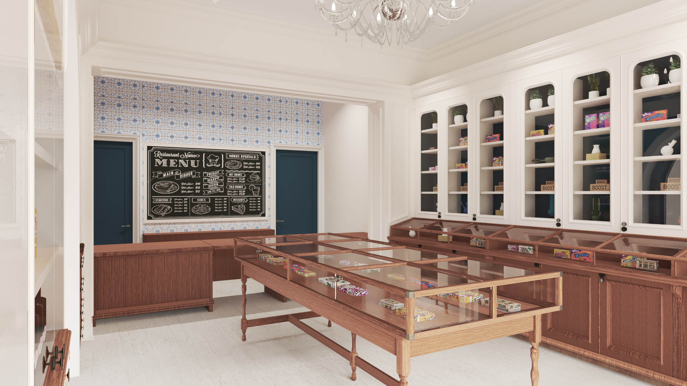
The Finished Product
Photoshoot
When all is said and done, you’ve got to get those polished looking photos. I worked with Donna Griffith to get these beautiful shots of the finished space.


